Contact

Super Dash

Super Dash

Super Dash

Creating a dashboard to help life insurance agents sell Ladder

Creating a dashboard to help life insurance agents sell Ladder

Team

5 members
Product Manager, Content Designer, Engineer (x2), and me (Product Designer)

Role

Product Design, Research, Analysis, Interaction Design, Design Systems, User-testing

Duration

5 months
January – June 2023

First, a quick introduction: Ladder is modernizing life insurance, making it fast, easy and simple to get coverage.

First, a quick introduction: Ladder is modernizing life insurance, making it fast, easy and simple to get coverage.

In 2022, Ladder launched a program for life insurance agents.

In 2022, Ladder launched a program for life insurance agents.

In 2022, Ladder launched a program for life insurance agents.

The program was created to generate a new source of traffic for Ladder, allowing agents to sell Ladder life insurance and earn commission.

By 2023, with our first set of agents beginning to utilize the platform, it was time to evaluate our approach.

The program was created to generate a new source of traffic for Ladder, allowing agents to sell Ladder life insurance and earn commission.

By 2023, with our first set of agents beginning to utilize the platform, it was time to evaluate our approach.

Our goal was to analyze the current dashboard's performance and identify the most painful user problems.

Our goal was to analyze the current dashboard's performance and identify the most painful user problems.

Our goal was to analyze the current dashboard's performance and identify the most painful user problems.

Initially launched with minimal external input, we suspected the dashboard was lacking.

I aggregated and analyzed data on the dashboard's performance. From the agents who visited the dashboard I discovered:

Initially launched with minimal external input, we suspected the dashboard was lacking.

I aggregated and analyzed data on the dashboard's performance. From the agents who visited the dashboard I discovered:

42%

visited the dashboard 2 or fewer times

visited the dashboard 2 or fewer times

visited the dashboard 2 or fewer times

61%

never generated a quote

never generated a quote

never generated a quote

61%

never copied their referral link

never copied their referral link

never copied their referral link

55%

never referred a single person

never referred a single person

never referred a single person

80%

sent either a single visitor or no visitors

sent either a single visitor or no visitors

sent either a single visitor or no visitors

It was clear that agent activation remained a problem to be solved.

It was clear that agent activation remained a problem to be solved.

It was clear that agent activation remained a problem to be solved.

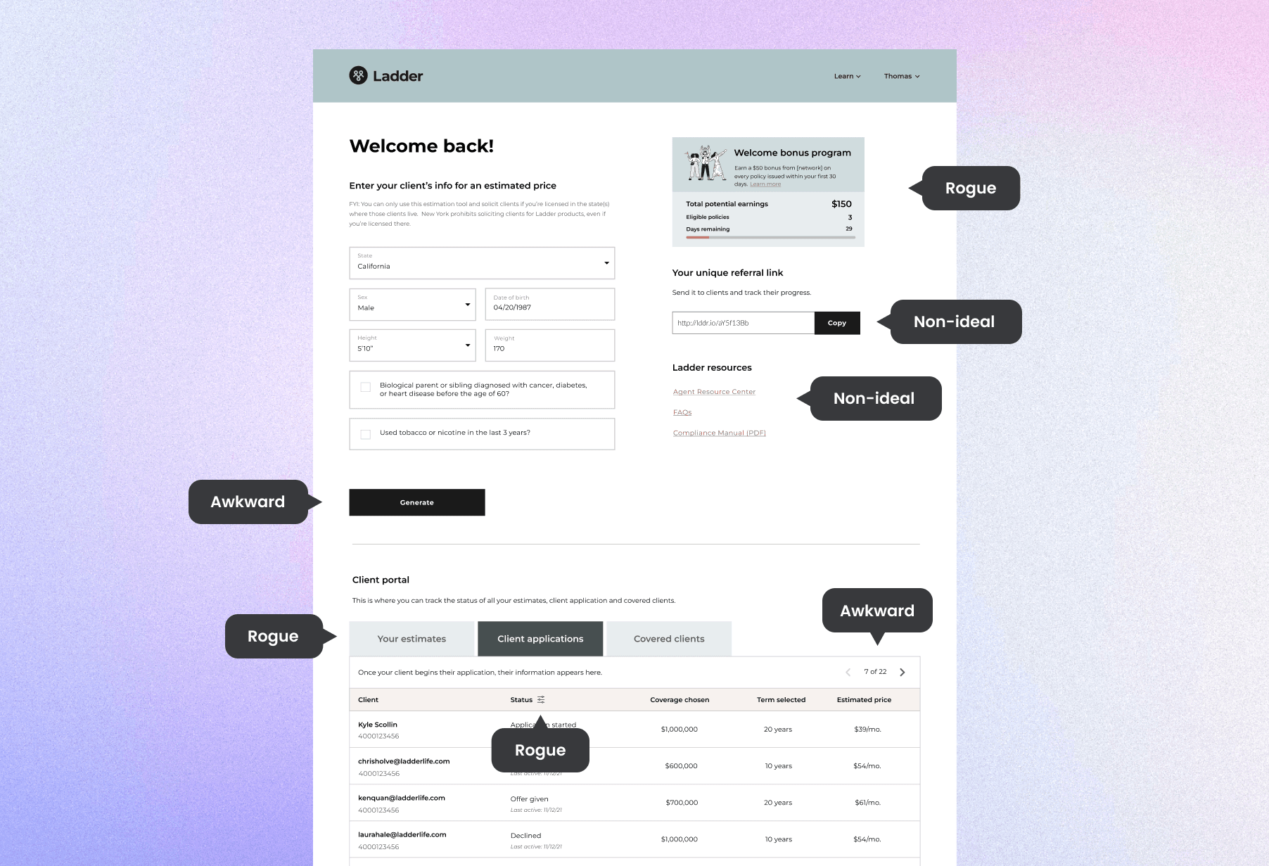
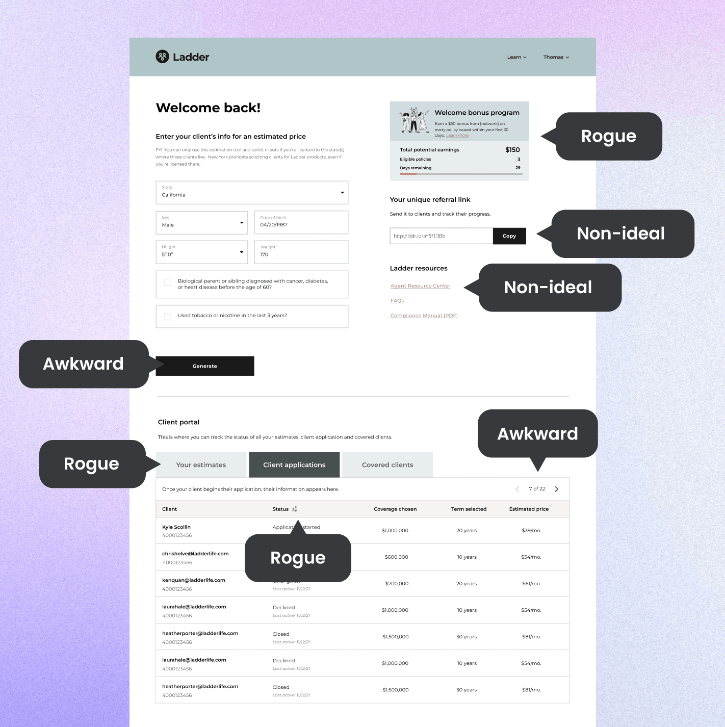
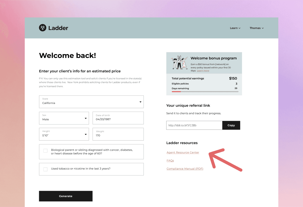
Ladder's core design system was built for a simple life insurance application. Utilizing it for a robust dashboard added extra complexity. Components that were needed did not exist, resulting in new rogue functionality, or avoided altogether.

Ladder's core design system was built for a simple life insurance application. Utilizing it for a robust dashboard added extra complexity. Components that were needed did not exist, resulting in new rogue functionality, or avoided altogether.

The dashboard had grown organically, become cluttered, and was hindered by the design system.

The dashboard had grown organically, become cluttered, and was hindered by the design system.

The dashboard had grown organically, become cluttered, and was hindered by the design system.

We needed to understand the agent's needs.

We needed to understand the agent's needs.

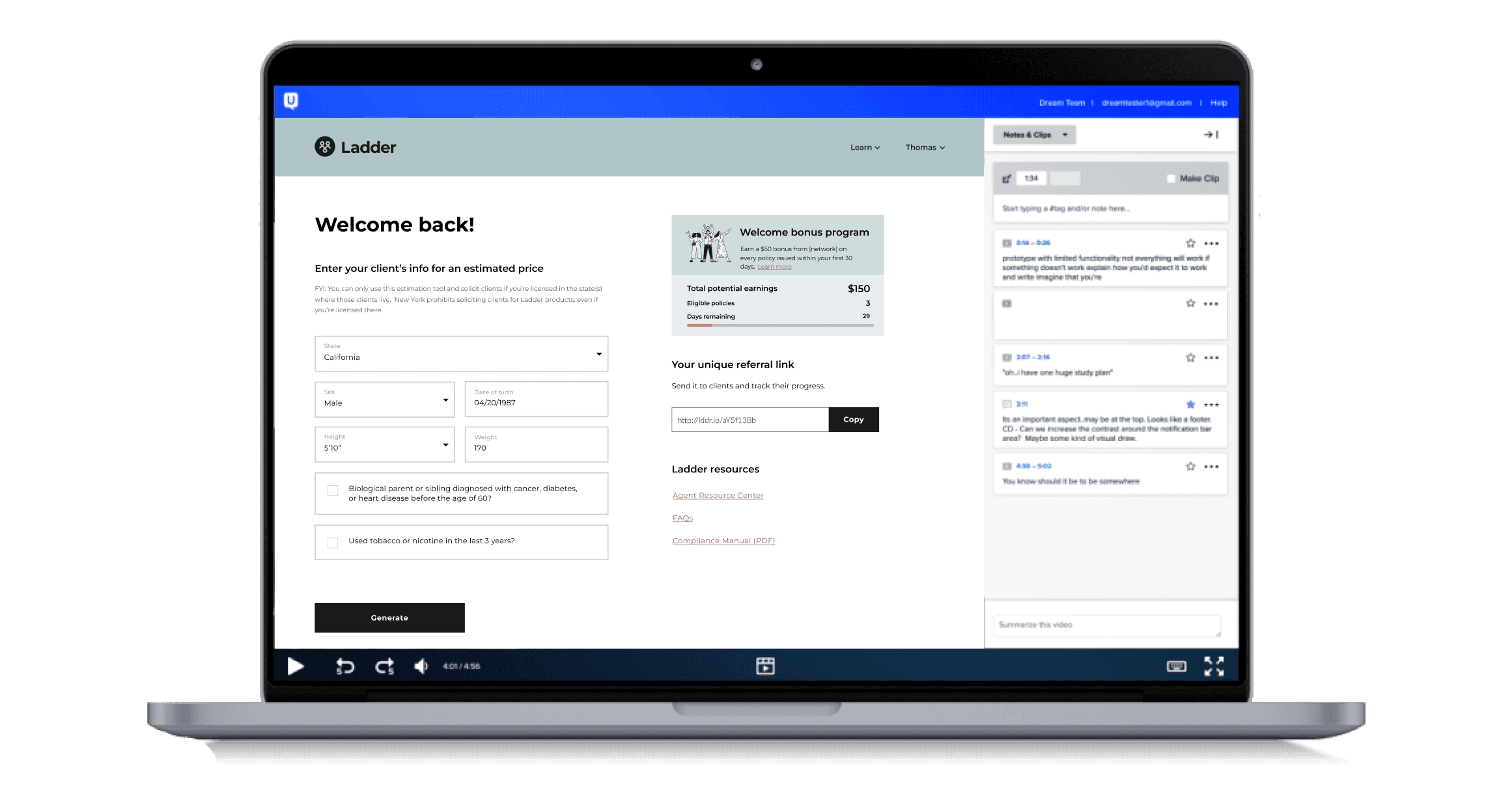
I observed agent behavior on the dashboard via FullStory, by conducting UserTesting tests, and through connecting with our business development team who speak directly with agents.

Key insights

Key insights

Key insights

1.

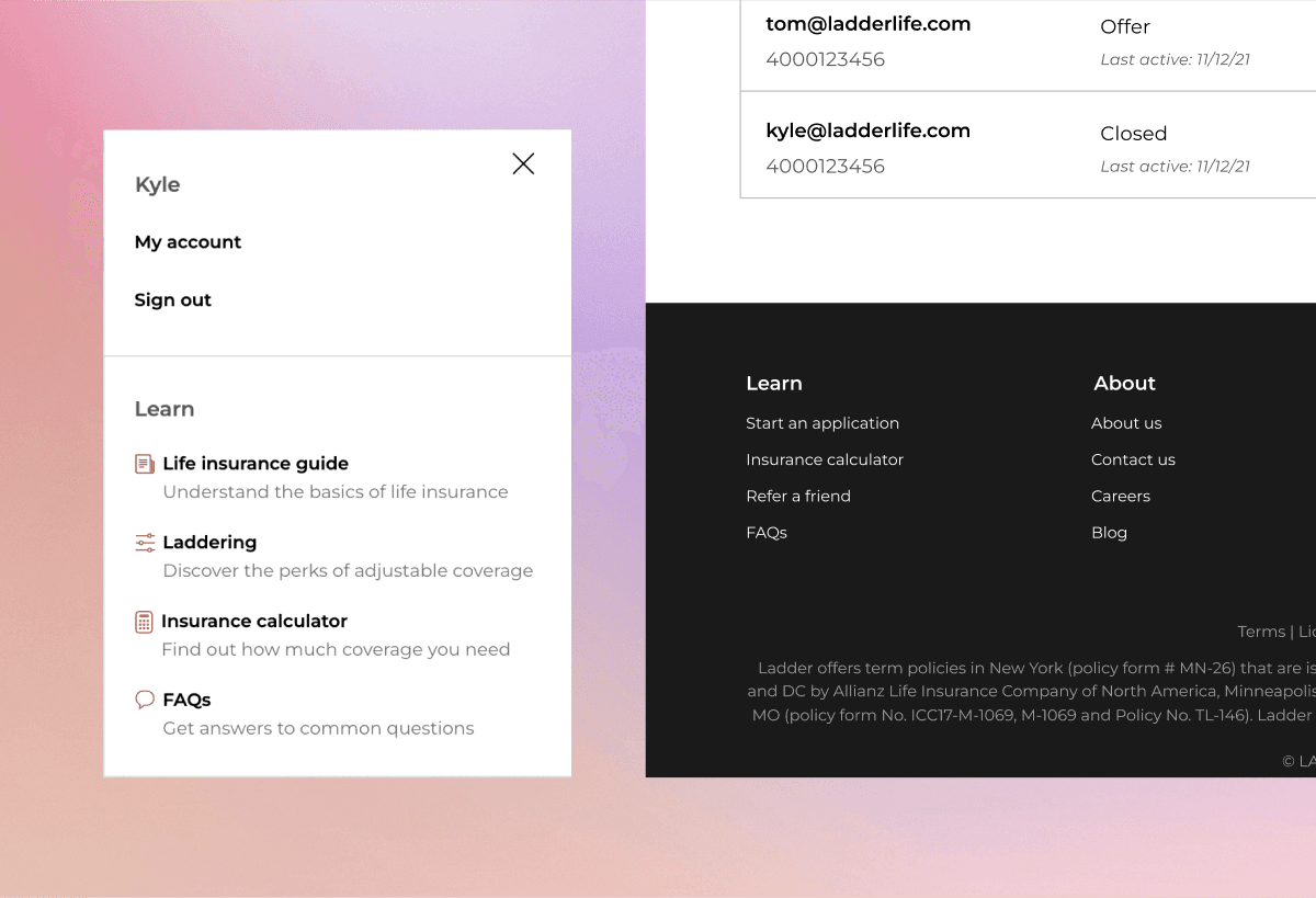
Agents frequently mistook the site wide menu and footer navigation as their own dashboard functionality.

2.

The resource center, which was a valuable learning resource, was often overlooked.

3.

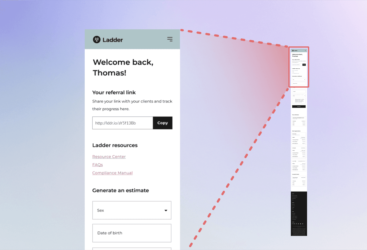
The mobile dashboard was fairly lengthy resulting in agents often missing functionality by scrolling past it, or not scrolling enough.

4.

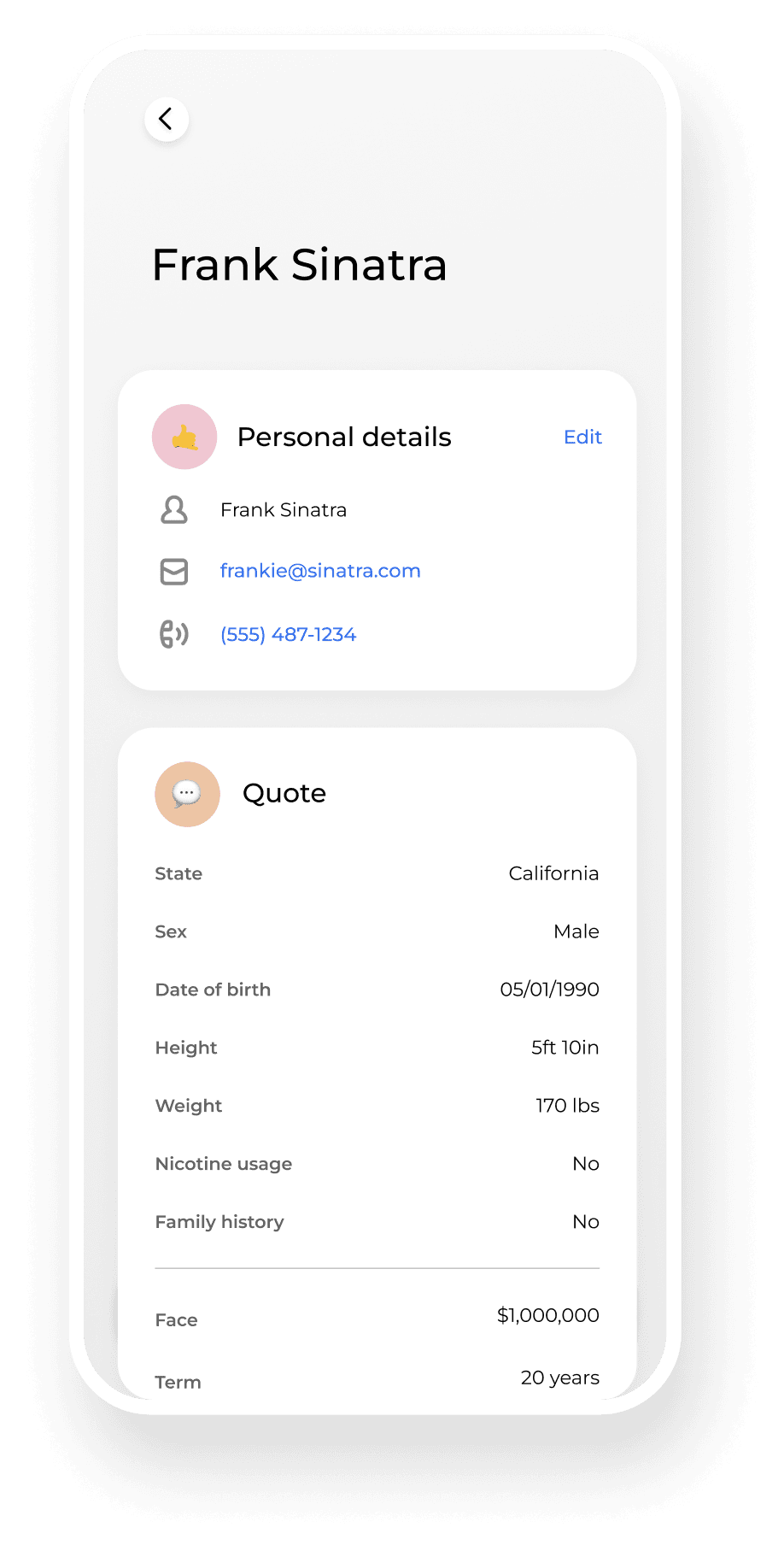
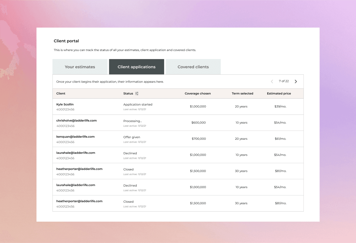
Client management was confusing and lacking. Agents wanted to click their client's names to edit or manage, but this functionality didn't exist.

“I'd love to be able to click on a client's name

and type in notes. I've got about 16 names on here now, and I'd love to… have a way to categorize them myself or a way to remove them."

“The portal seems, not lacking, but… I can't actually click Clayton's application. Like

I can't actually click into the client. I want to see where he’s at in the app.”

“I’m clicking her name and I’m just highlighting her name. How do I change her address? How do I manage it for her in there?”

From these key insights, we knew the dashboard needed to be overhauled.

From these key insights, we knew the dashboard needed to be overhauled.

From these key insights, we knew the dashboard needed to be overhauled.

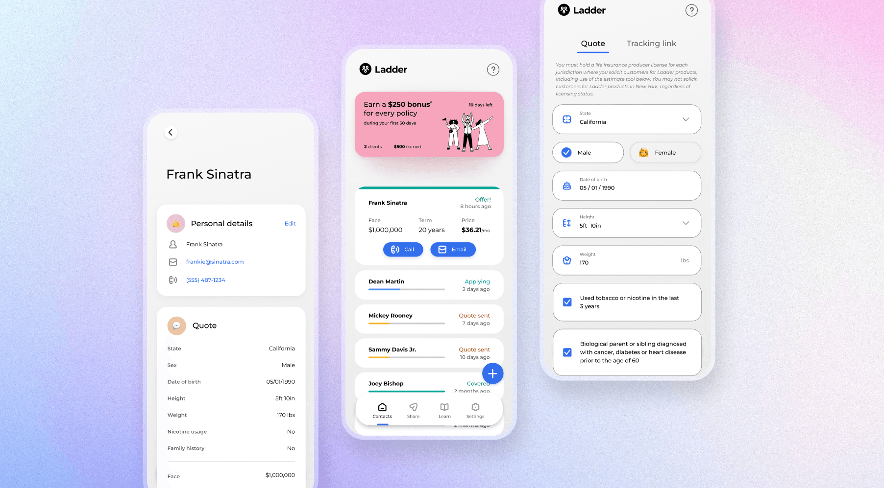
Our goal for this project was to completely reorganize the dashboard, removing the sitewide navigation, increasing visibility of the resource center, and building brand new client management functionality. With that in mind, it was a perfect opportunity to rethink our design system.

Our goal for this project was to completely reorganize the dashboard, removing the sitewide navigation, increasing visibility of the resource center, and building brand new client management functionality. With that in mind, it was a perfect opportunity to rethink our design system.

I wanted to create a system that felt modern, clean and straightforward, while packing in powerful functionality.

I wanted to create a system that felt modern, clean and straightforward, while packing in powerful functionality.

I wanted to create a system that felt modern, clean and straightforward, while packing in powerful functionality.

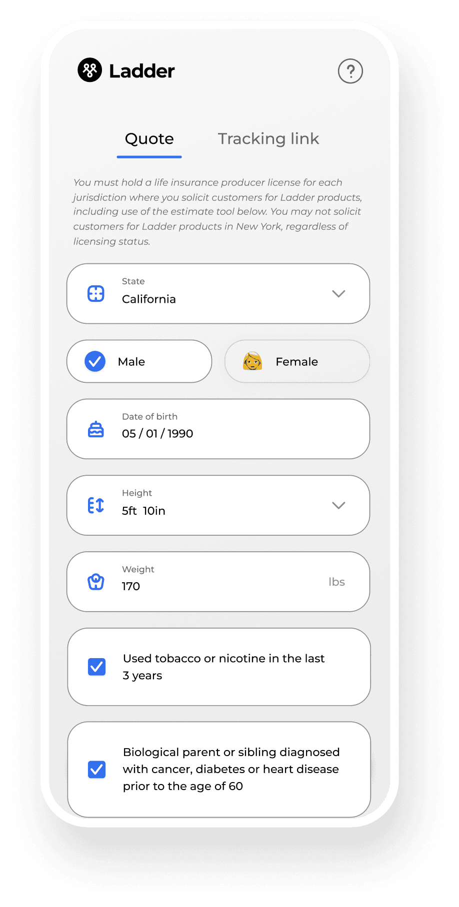
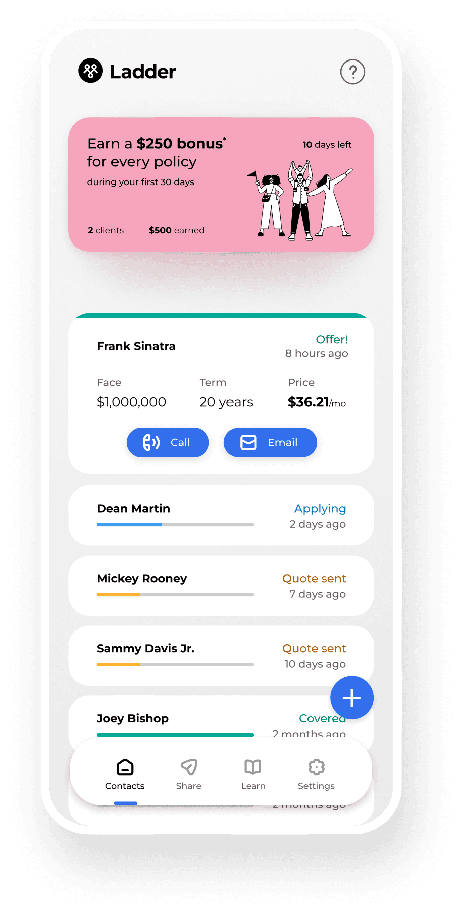
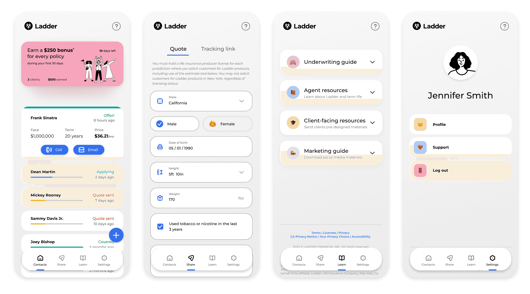
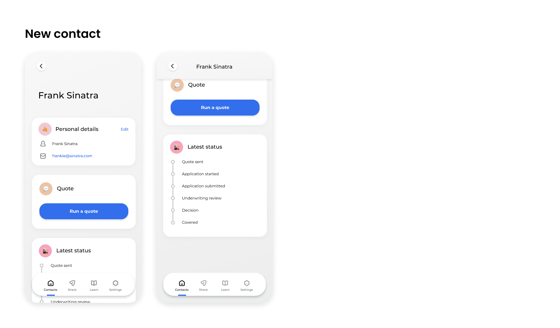
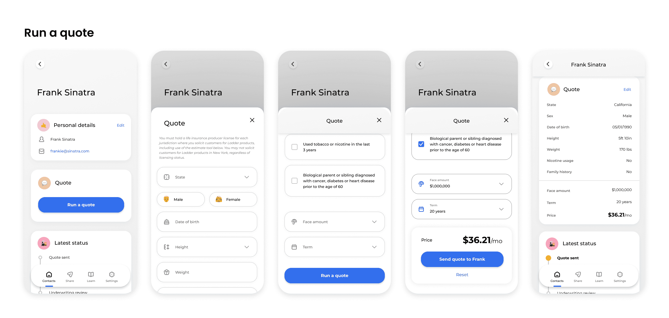
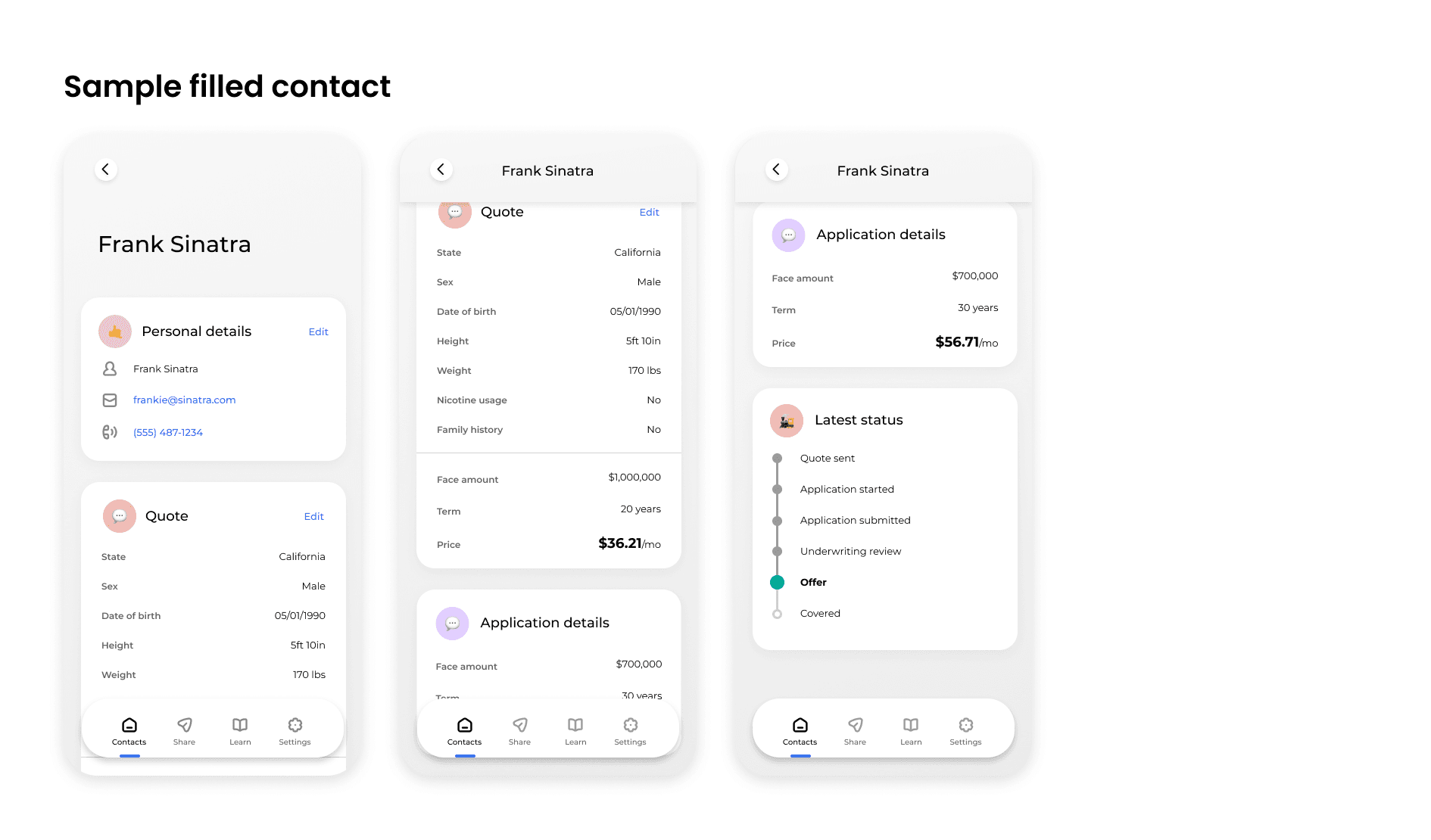
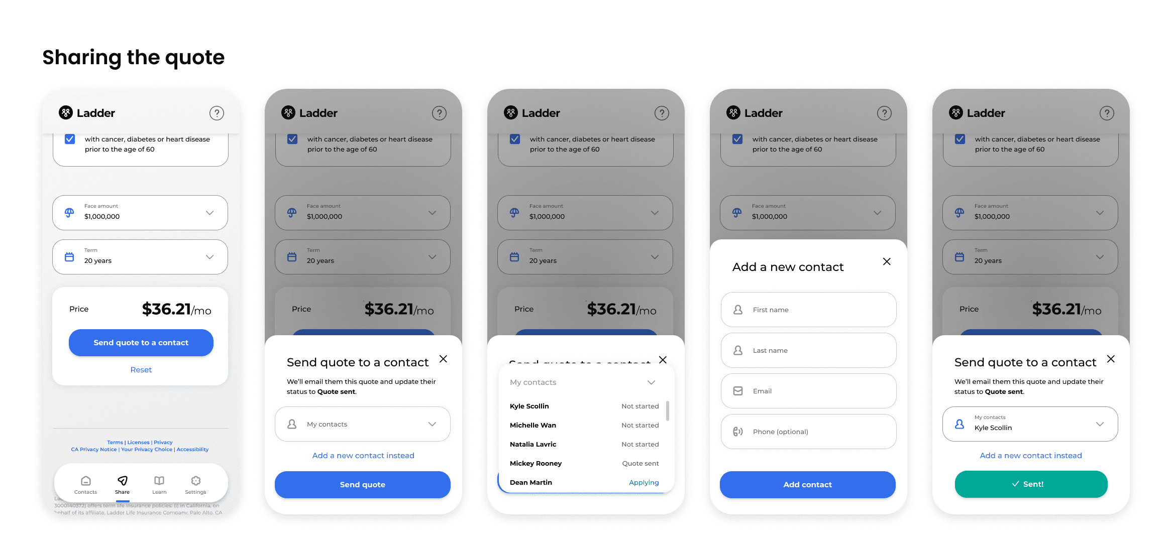
Agents are busy, always on the move and benefit by having things clear and understandable. Focusing on mobile first, I segmented the dashboard into 4 sections, each with a clear primary action.

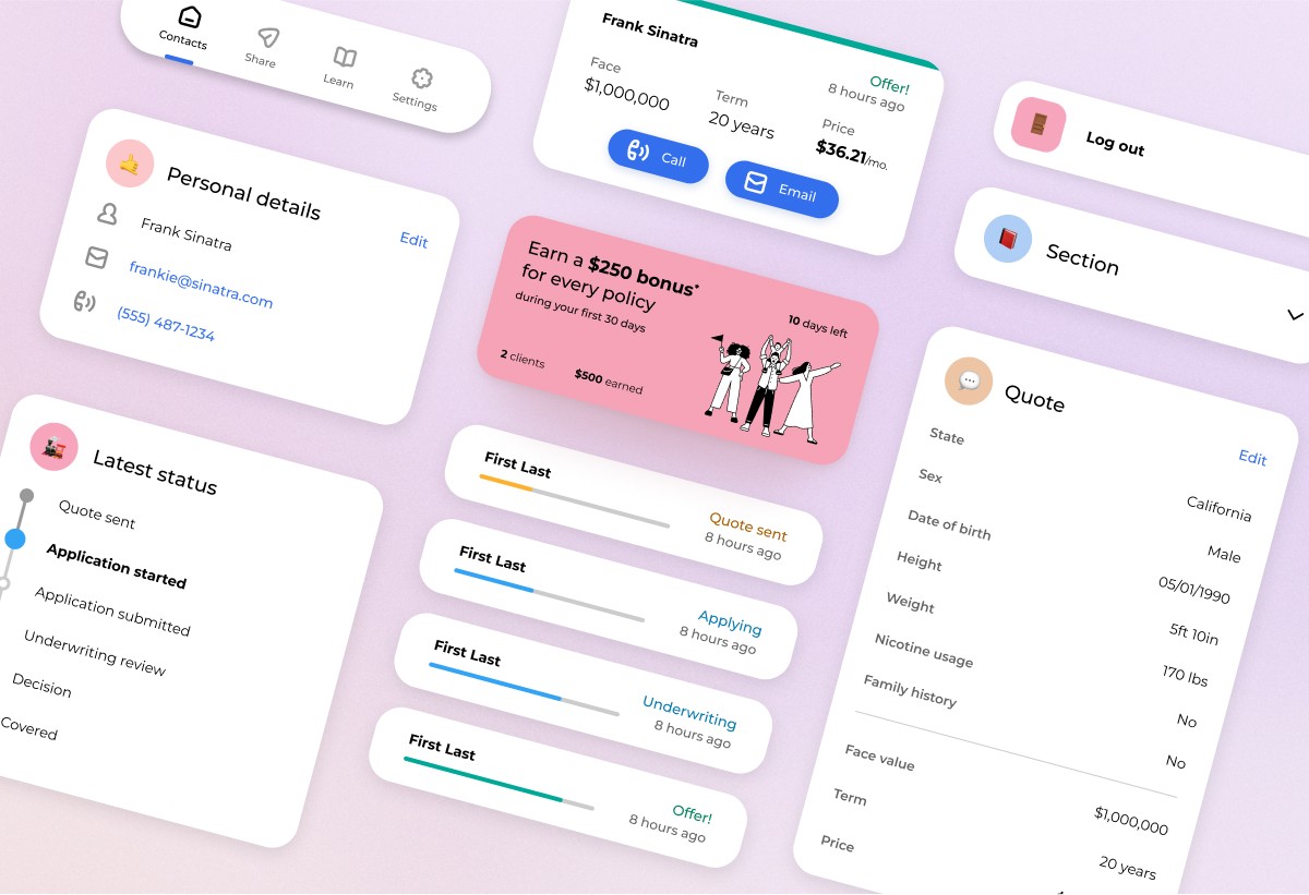
Utilizing layers, I was able to keep tasks focused by surfacing only the most important information, while still keeping functionality available. By creating boxes to hold content, additional capabilities could easily be added in the future, giving our system flexibility.

After compiling a sample of what the dashboard might look like, I ran UserTests to test our assumptions, and the results were great.

100% of participants preferred the new dashboard.

100% of participants preferred the new dashboard.

100% of participants preferred the new dashboard.

When compared against the original dashboard, participants were delighted by the new client management features. They also were able to more successfully complete the tasks assigned to them.

“I love [Super Dash]. I’m a huge fan of [Super Dash].”

“[Super Dash] looks a lot more modern and aesthetically pleasing”

“[Super Dash] was way more simple. The UX design was way more clean, way more modern. This [current dashboard] feels way more cluttered to me.”

“I like [Super Dash] already a lot better. It’s easier to get to the things I need, and it feels a lot more organized.”

With great user feedback, the final details were worked out for launch.

With great user feedback, the final details were worked out for launch.

With great user feedback, the final details were worked out for launch.

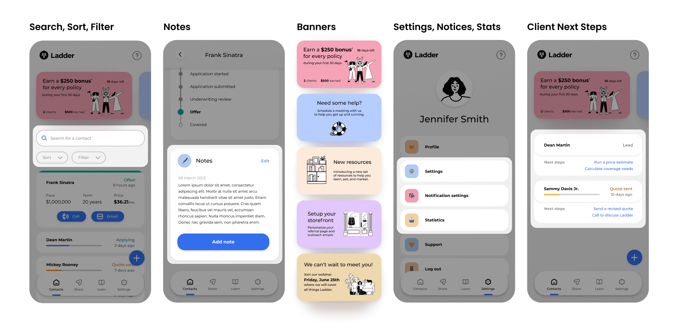
During this process, a lot of work was done to identify and narrow the set of features needed for launch. Removing these more complex features allowed for quicker development without greatly impacting the dashboard performance. Some examples of the features we ended up cutting included:


  1. Search, Sort, Filter – With our most advanced users having limited contacts, and a majority having 1 or fewer contacts, we felt comfortable delaying shipping this feature.

  2. Notes – Similarly, this requested feature packed a fair amount of complexity and development time that felt unnecessary for many agents.

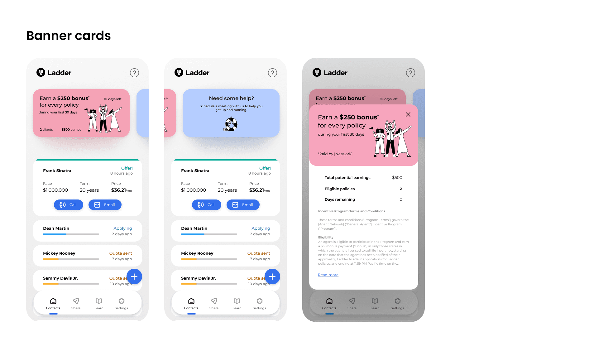
  3. Banners – Though we only shipped one banner, the long term vision imagined this space full of helpful directives.

  4. Settings, Notices, Stats – As the program grew, I imagined multiple ongoing outreach campaigns, as well as motivational statistics to encourage agent activity.

  5. Client Next Steps – Our offering automated much of the process, so giving agents clear next steps felt like a helpful power feature, but one that wasn't necessary for launch.
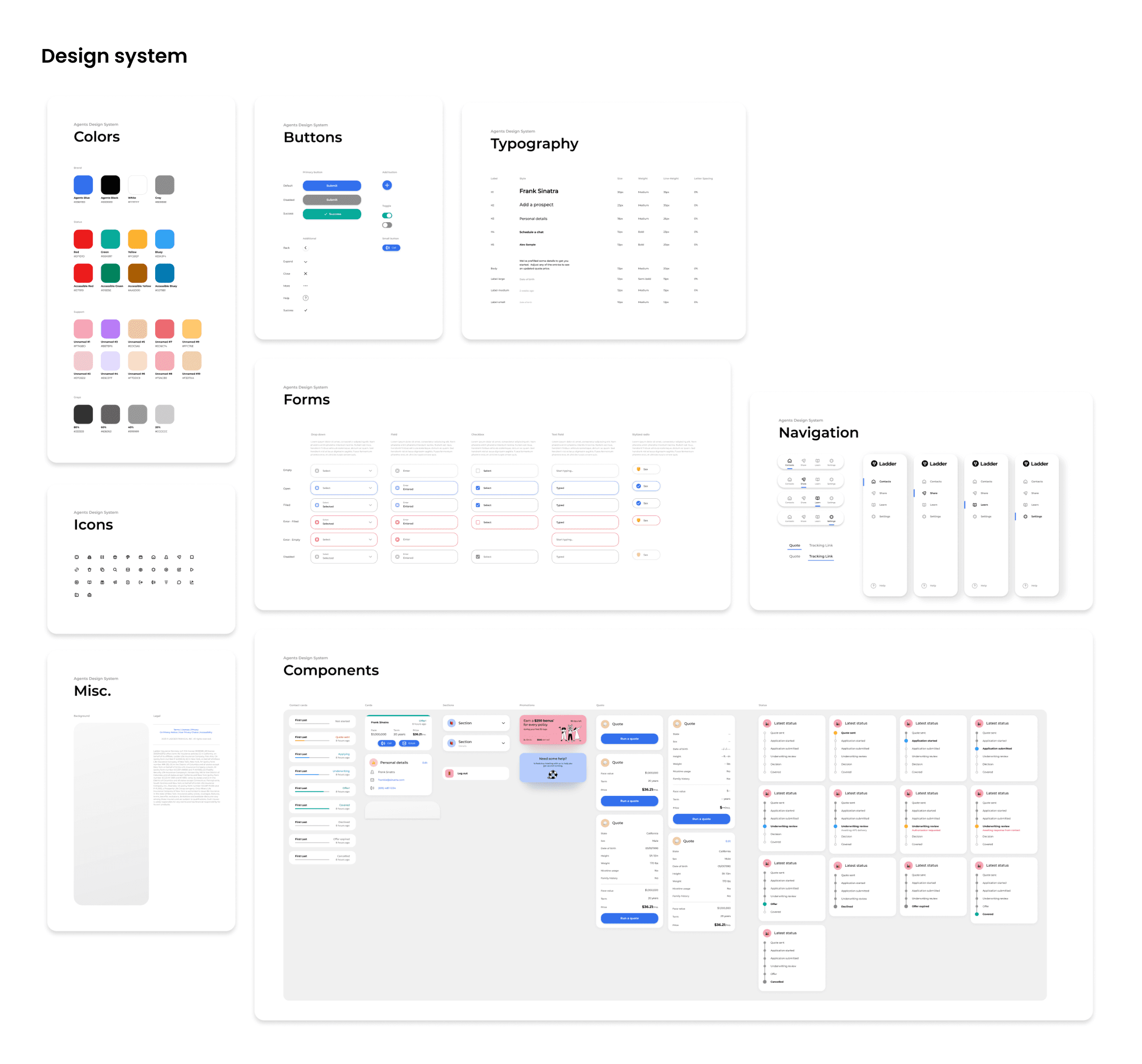
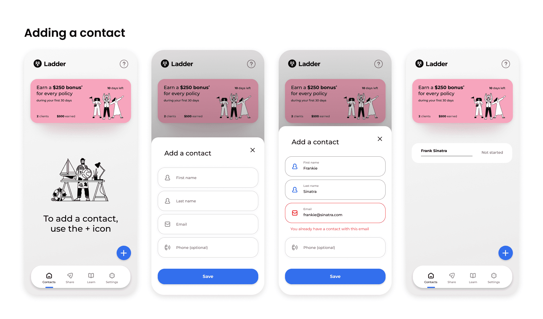
Being more familiar with agent engagement on the dashboard, the redesigned dashboard did a better job capturing edge cases and error states. I then closely collaborated with engineering during production to ensure a successful launch.

The dashboard had a very successful launch!

The dashboard launched in January 2024, and agents sold 2.2x the previous best month's policies. Then in the very first week of February, agents sold 2.4x the number of policies sold in January. Agents have been sharing lots of praise about the new dashboard.

I'll end with one last agent testimonial after launching the new dashboard:

"This is the easiest freaking thing ever! I'm trying to get everyone in the office on this sh*t."

Final screens

Final screens

Final screens

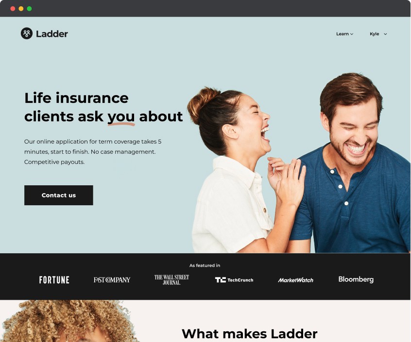
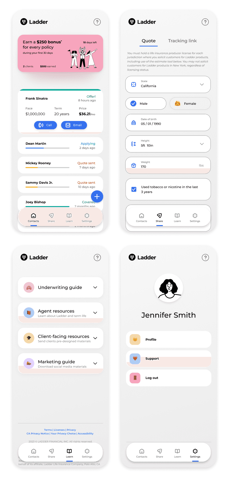
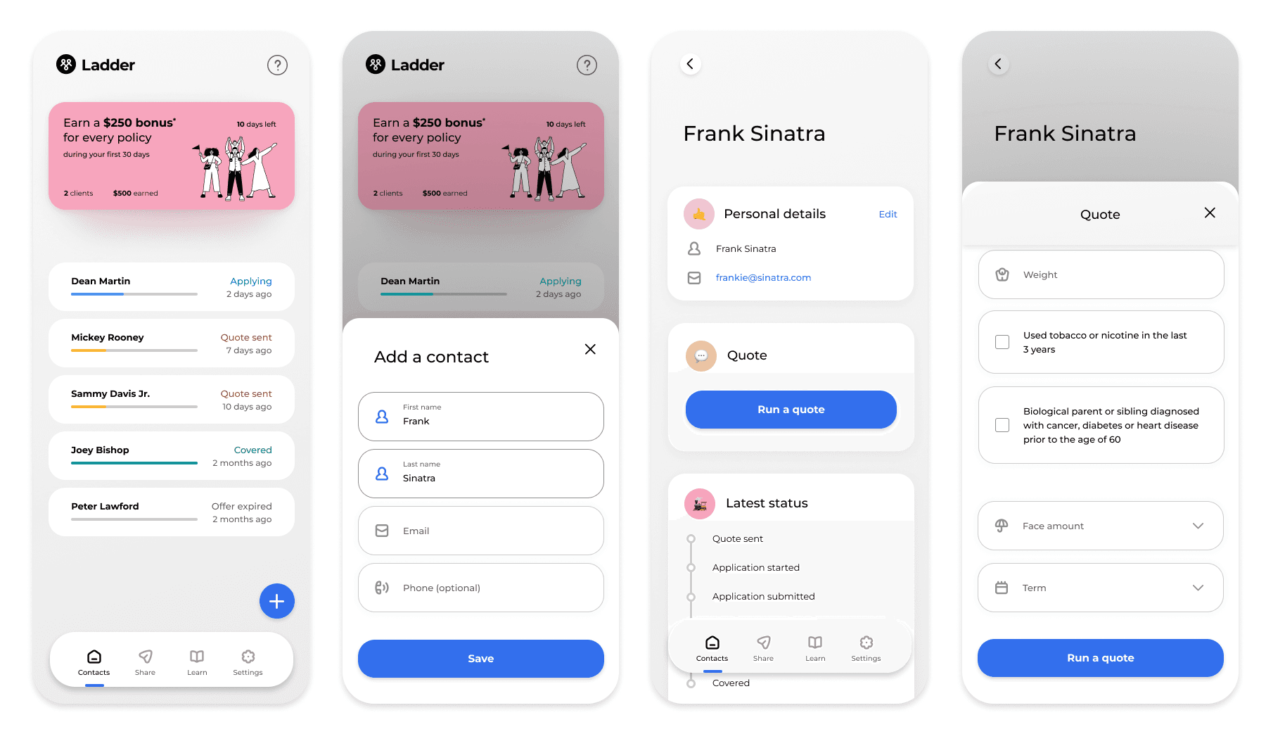
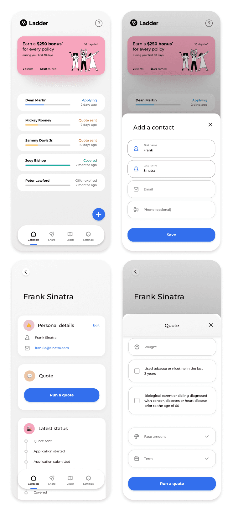
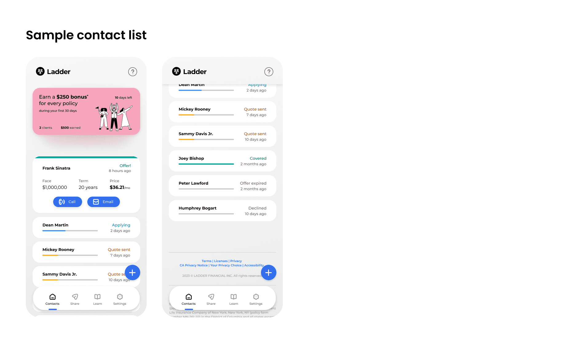
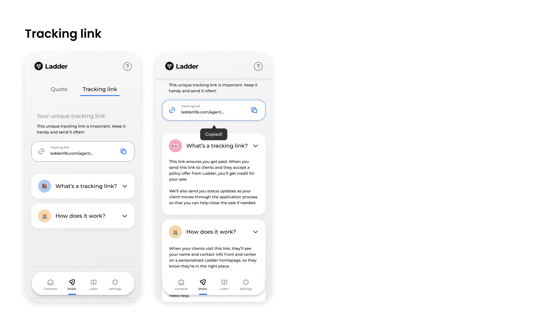
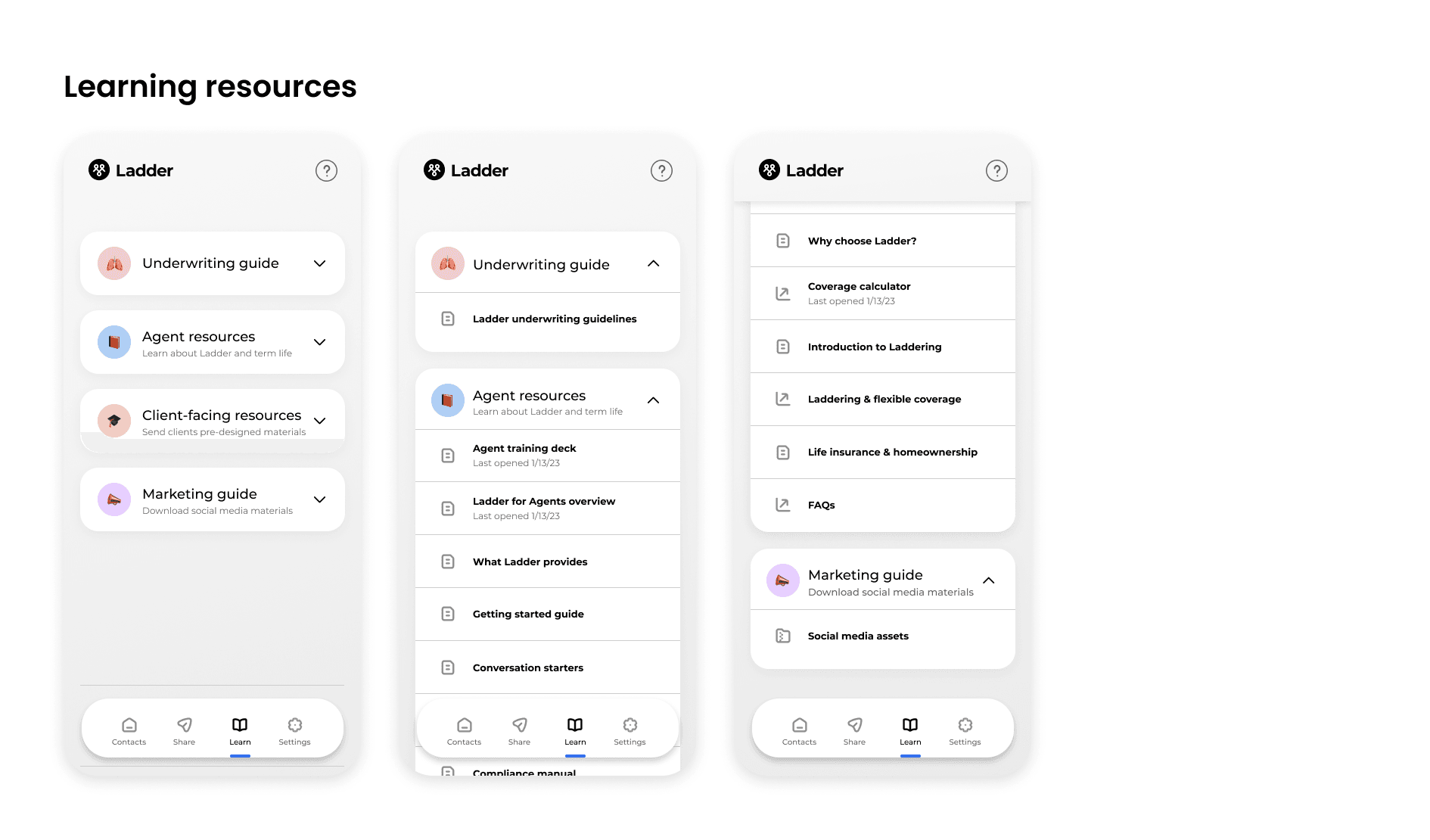
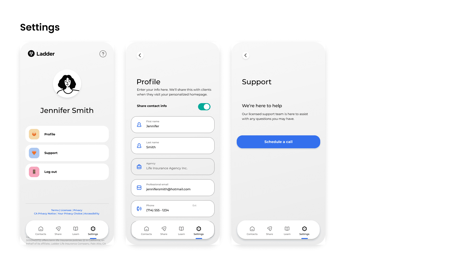
A showcase of the capabilities and functionality of the dashboard.

Thanks for stopping by

Thanks for stopping by

I'd love to hear from you.

Get in touch